

Vintage Styling Mistakes That Make a Home Look Cluttered Instead of Curated
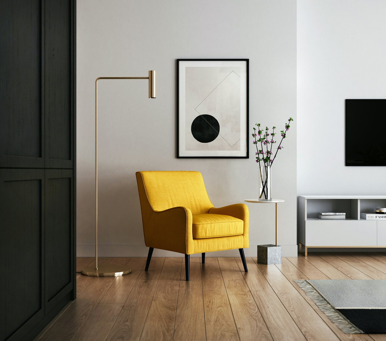
The difference between a vintage-styled home that reads as curated and characterful and one that reads as cluttered and confused is not primarily a difference in the quality or the age of the objects present: it is a difference in the editing and the integration of those objects within the home as a whole. The vintage home that works is a home where the objects from different periods and different sources have been selected, arranged, and combined with sufficient intentionality that they read as a coherent vision rather than an accumulation. The vintage home that doesn't work is one where the accumulation has proceeded without sufficient editing, where incompatible styles compete rather than complement, and where the inherent appeal of individual finds is undermined by the context in which they are placed.
The most common vintage styling mistake is the failure to edit: the continuation of accumulation without the counterbalancing process of curation that keeps a vintage interior feeling collected rather than collected-up. The enjoyment of finding and bringing home interesting vintage objects is such a genuine pleasure that it is easy to continue past the point at which the home can absorb additional pieces without feeling overwhelmed. The signal that editing is overdue is when visitors describe the home as "eclectic" with the hesitation that indicates they mean something closer to "busy" — when the overall impression of the home is richness of content rather than richness of character.
Mistake: Incompatible Styles Without a Unifying Thread
The second most significant vintage styling mistake is combining objects from incompatible periods and styles without a unifying thread that holds them together. The vintage interior that works combines finds from different periods but shares a consistent palette, a consistent material language, or a consistent scale register that makes the combination feel like a point of view rather than a category error. The Victorian sideboard that works with the 1950s lamp and the 1970s ceramic works because all three share a warmth of material, a depth of color, and a quality of craft that provides the unifying thread; the same Victorian sideboard with a 1980s chrome-and-glass lamp and a 1960s plastic object has no thread and reads as incompatible.
The practical approach to identifying the unifying thread of a specific vintage collection is to look at the pieces already present that work best together — that feel as if they were meant to be in the same room regardless of their separate origins — and to identify what they have in common. That common quality is the thread; future acquisitions can be evaluated against it, and existing pieces that lack it can be assessed for whether they warrant keeping or whether they would be better donated to give another collector their thread to discover. The unifying thread is rarely about period: it is more often about palette (warm earth tones versus cool blues, natural materials versus high-shine surfaces), about material (wood and ceramic versus metal and glass), or about aesthetic register (rustic and handmade versus refined and decorative).
Mistake: Vintage Objects Without Breathing Room
The third common vintage styling mistake is displaying vintage objects without sufficient visual breathing room — packing shelves, surfaces, and walls so densely with interesting finds that the eye cannot rest on any individual object long enough to appreciate it. Vintage objects often have high individual visual complexity — varied surfaces, multiple colors, intricate forms — and when too many of them are displayed in close proximity, the complexity accumulates into visual noise rather than visual richness. The correction is to space individual objects sufficiently that the eye can travel from one to the next with adequate pause between them, and to use negative space — empty portions of shelf, unoccupied areas of surface, blank stretches of wall — as a deliberate element of the display rather than as an oversight waiting to be filled.
The gallery principle applies in the vintage home as it does in the museum: objects displayed with generous surrounding space are elevated; objects displayed in crowded proximity are diminished. A single beautiful vintage ceramic placed on a shelf with space around it reads as a considered choice; the same ceramic in a shelf packed with similar objects reads as part of an undifferentiated collection. The editing that removes objects to create breathing room for those that remain is not a loss of character but its enhancement. Explore our curated collection at Little-Chapter.com for contemporary accessories, neutral storage solutions, and quality basics that provide the considered context in which vintage finds can be displayed to their best advantage.