

Open Shelving Styling Tips: The Art of the Beautiful, Functional Shelf
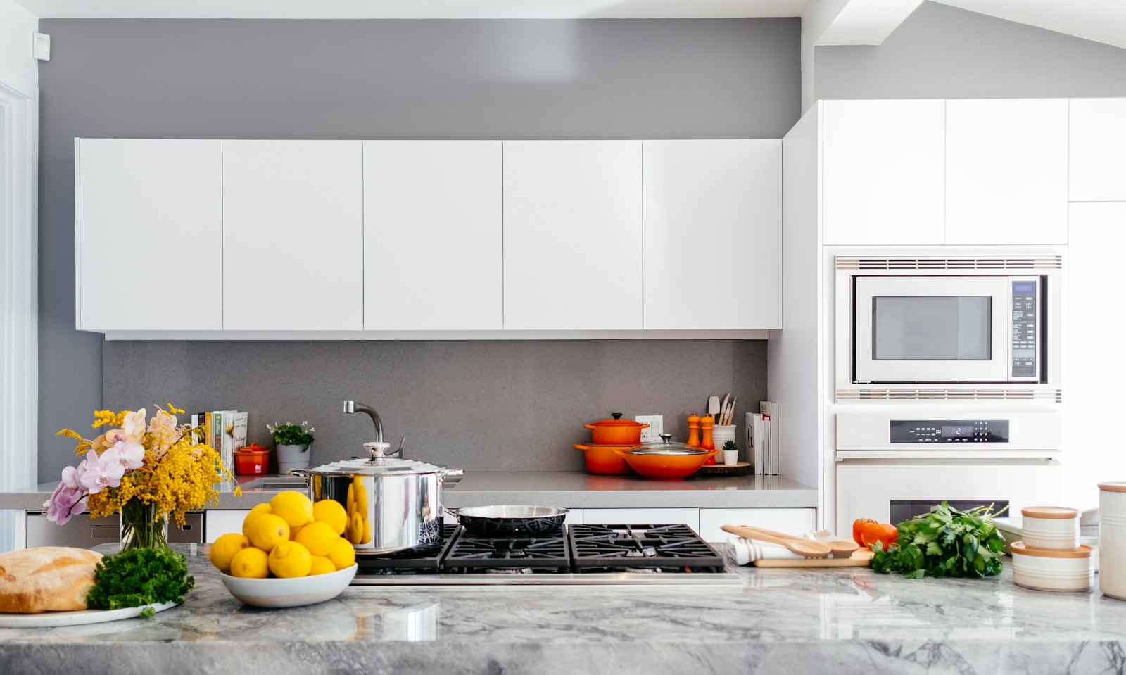
Open shelving is one of those design choices that divides decorators into passionate camps. Those who love it point to its ability to display beautiful objects, make rooms feel more open and airy, and bring a quality of personality and life to any space. Those who are skeptical point to the dust, the pressure to keep everything looking good, and the way a poorly styled open shelf can make a room feel cluttered and chaotic rather than curated and considered. Both camps are right — and the difference between a shelf that works and one that does not lies almost entirely in how it is styled.
Open shelving works in every room of the house, from the kitchen to the living room to the bathroom, but the principles of good shelf styling are consistent across all contexts. Understanding those principles — the role of negative space, the importance of varying height and depth, the power of grouping — is the key to creating shelves that look as good on an ordinary Tuesday as they do when they are freshly arranged and photographed.
The Rule of Negative Space
The single most common mistake in shelf styling is overcrowding. When every inch of a shelf is filled with objects, the individual pieces lose their visual impact and the overall effect is one of clutter rather than curation. Negative space — the empty areas on a shelf — is not wasted space but an active design element that allows the objects you display to breathe and be seen. A well-styled shelf typically has at least thirty percent of its surface area empty, and this restraint is what gives the displayed objects their significance.
Negative space can be introduced in different ways. A section of shelf left completely clear between two groups of objects. A single object displayed in the center of a shelf with empty space on either side. A tall object flanked by shorter ones that leave triangular areas of emptiness. Each of these approaches creates breathing room while maintaining visual interest, and the effect is a shelf that feels designed rather than merely filled.
Height, Depth, and Visual Rhythm
Good shelf styling works with varying heights to create visual rhythm and interest. A shelf on which everything is the same height is static and dull; a shelf with objects of varied heights — tall vases next to small ceramics, a stack of books next to a single taller piece — has movement and interest. The general principle is to vary heights within groups rather than across the whole shelf, creating clusters of varying heights with negative space between them.
Depth variation — placing some objects at the front of the shelf and others further back — adds another dimension to the display, creating a sense of layering and depth that makes the shelf more interesting to look at from different distances. A small object placed in front of a larger one creates a sense of foreground and background. A book or print leaned against the back of the shelf, with objects placed in front of it, creates a backdrop that gives the smaller objects visual context and makes them easier to see.
Grouping and the Rule of Odd Numbers
Objects displayed in groups of odd numbers — three, five, or seven pieces together — tend to look more naturally balanced and more visually interesting than groups of even numbers. This is one of the oldest and most consistently reliable rules in styling, and it works because odd numbers resist the tendency toward symmetry that makes even groupings look formal and stiff. A trio of ceramics in varying heights and slightly different glazes. A group of five books with a small object nestled beside them. These groupings feel natural and composed without feeling staged.
Within each group, connect the objects with at least one common thread: a shared color, a shared material, a shared scale. This common thread is what makes a group of objects feel like a curated display rather than a random collection. A group of three ceramics in different forms but the same glaze color reads as a considered display. The same three ceramics in completely unrelated colors reads as clutter.
Books as Styling Elements
Books are among the most versatile and most beautiful elements in any shelf display. They bring color through their spines, texture through their varied covers, and personal character through their titles. Books can be displayed standing upright in rows, stacked horizontally in piles of varying heights, or leaned at an angle for a more casual effect. A combination of all three approaches on the same shelf creates a natural, lived-in quality that is both beautiful and authentic.
Grouping books by color — arranging spines in a spectrum or keeping similar tones together — creates a display of extraordinary visual coherence that works even in rooms with complex color schemes. Removing dust jackets from hardcover books reveals the often-beautiful cloth covers beneath and gives the shelf a more unified, less commercial quality. Mixing books with plants and ceramics creates a shelf that lives and breathes alongside the static objects, changing with the seasons and with your reading habits. Explore our curated collection at Little-Chapter.com for beautiful ceramics, prints, and styling objects that bring your shelves to life.