

Neutral Color Palette Guide: How to Use Whites, Beiges, and Warm Tones Beautifully
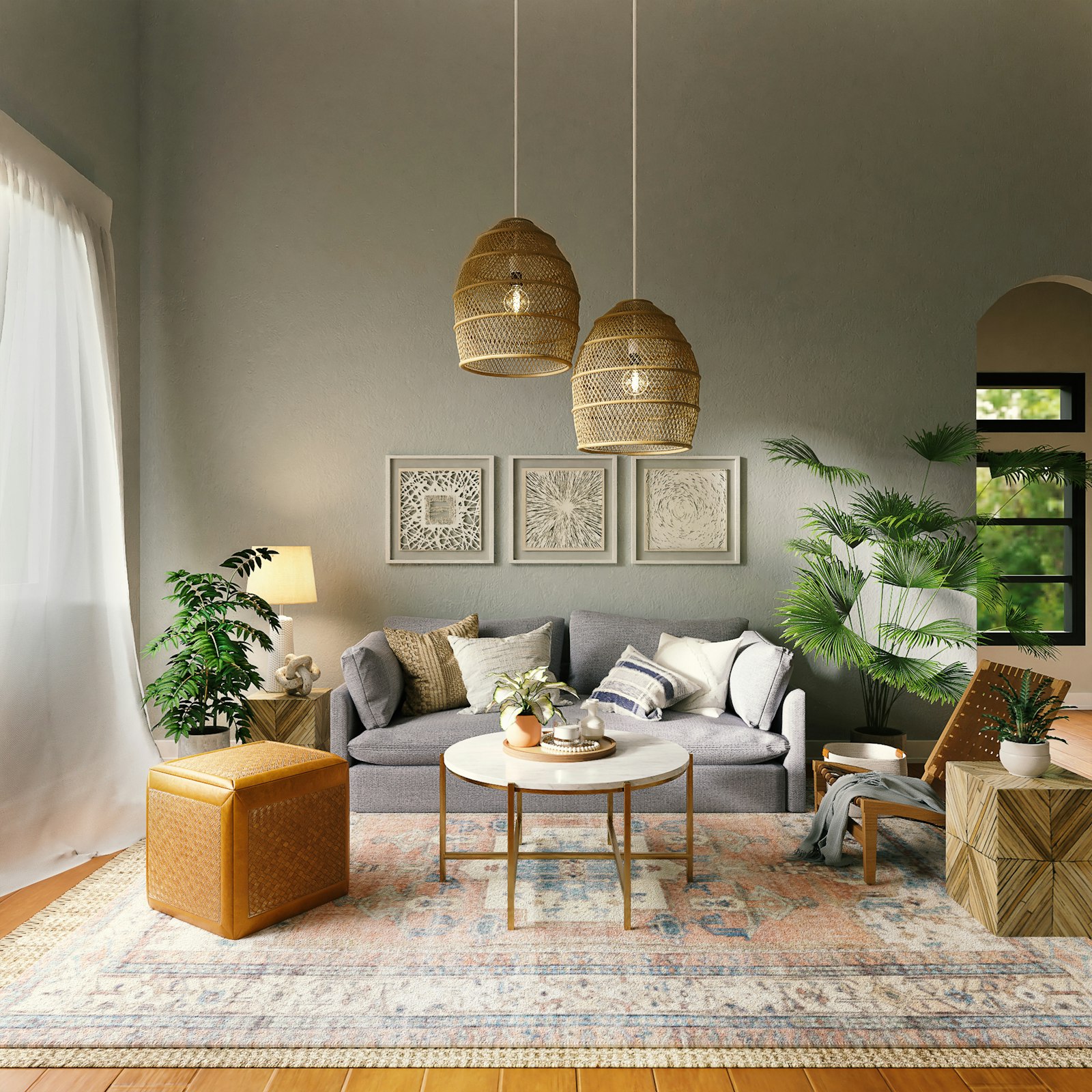
Neutral color palettes have dominated interior design for the better part of a decade, and there are good reasons for their enduring appeal. A well-executed neutral room has a quality of calm and coherence that more colorful interiors can struggle to achieve. It photographs beautifully. It works as a backdrop for art, textiles, and collected objects without competing with them. It tends to feel timeless rather than trend-dependent. And perhaps most importantly, it is genuinely restful to live in — the kind of environment that slows the nervous system and allows the mind to breathe.
But neutral does not mean simple, and the biggest misconception about neutral color palettes is that they are easy. In fact, working successfully with neutrals requires a more sophisticated understanding of color than most people realize. The differences between a warm white and a cool white, between a greige that leans yellow and one that leans grey, between a beige that reads as elegant and one that reads as muddy — these distinctions are subtle but significant, and getting them wrong is what produces the flat, dull, characterless rooms that give neutral palettes a bad reputation.
Understanding Warm and Cool Neutrals
Every neutral color has an undertone that determines whether it reads as warm or cool, and this undertone must be consistent throughout a room for the palette to feel cohesive. Warm neutrals — those with undertones of red, yellow, or orange — include creamy whites, soft oatmeals, warm sand tones, and the whole family of terracotta-adjacent beiges. Cool neutrals — those with undertones of blue, green, or purple — include bright whites, pale greys, greige tones that read silver, and the various taupes that lean toward purple.
Mixing warm and cool neutrals in the same room — pairing a warm cream wall color with cool grey furniture, for example — almost always looks wrong, a subtle but pervasive clash that makes both colors look worse than they would alone. The solution is to commit to a temperature: choose all warm or all cool, and let the variety within that temperature family provide the interest and complexity the palette needs.
Building Depth with Tonal Variation
A neutral room that uses only one or two tones tends to feel flat and uninteresting, however beautiful those individual tones may be. The secret to a successful neutral palette is tonal variation — working with a range of values within the same color family, from the lightest and most ethereal to the darkest and most grounded. A room that moves from a soft white ceiling through warm cream walls to a slightly deeper linen sofa to a warm caramel-toned wood floor has tonal depth and movement that a single-tone neutral room cannot achieve.
The principle of working from light above to dark below — lighter tones on ceilings and upper walls, darker tones on floors and lower furnishings — is grounded in the way light naturally falls in a room and in the way we experience the natural world (sky above, earth below). Following this principle in a neutral room creates an inherently satisfying tonal progression that feels right without necessarily feeling designed.
Texture: The Essential Companion to Neutral Color
In a room without the visual interest of strong color or bold pattern, texture becomes the primary source of richness and variety. Rough linen cushions against a smooth wool sofa. A chunky jute rug beneath a polished wood coffee table. A matte plaster wall beside a glossy ceramic vase. A nubby bouclé throw on a smooth leather armchair. These textural contrasts create the kind of visual complexity that neutral rooms need to avoid feeling monotonous, and they do so without introducing color or pattern that might disturb the serene overall effect.
Natural materials are the best sources of texture in a neutral interior, because they bring not just surface variation but a quality of organic irregularity that manufactured materials cannot replicate. The slight variation in the weave of a linen fabric. The grain of a piece of solid oak furniture. The handmade quality of a ceramic pot with its subtle surface variation. These natural textures are what give neutral interiors their warmth and depth, transforming what might otherwise be a cold and characterless color scheme into something genuinely beautiful.
Accent and Contrast in the Neutral Room
Even the most committed neutral palette benefits from at least some degree of contrast and accent, and the question is not whether to introduce it but how and where. In a warm neutral room, accents might be introduced through darker neutrals — a charcoal throw, a near-black vase, a deep walnut side table — that provide definition without introducing color. Or through a single color used sparingly: a single terracotta cushion in an otherwise all-neutral room, one sage green plant in a cream and sand interior.
The power of the neutral backdrop is that it makes whatever you place against it look better than it would in a more complex environment. A single beautiful vase in a warm amber glass, displayed against a cream wall with a warm wood shelf, achieves a visual impact that the same vase in a busier environment would never reach. The neutral room is generous to beautiful objects in a way that more assertive color schemes are not, and this generosity is one of its greatest gifts. Explore our curated collection at Little-Chapter.com for textiles, ceramics, and natural accessories in the warm, beautiful neutrals that make any room feel calm and complete.