

Neutral color palette guide: A Complete Guide
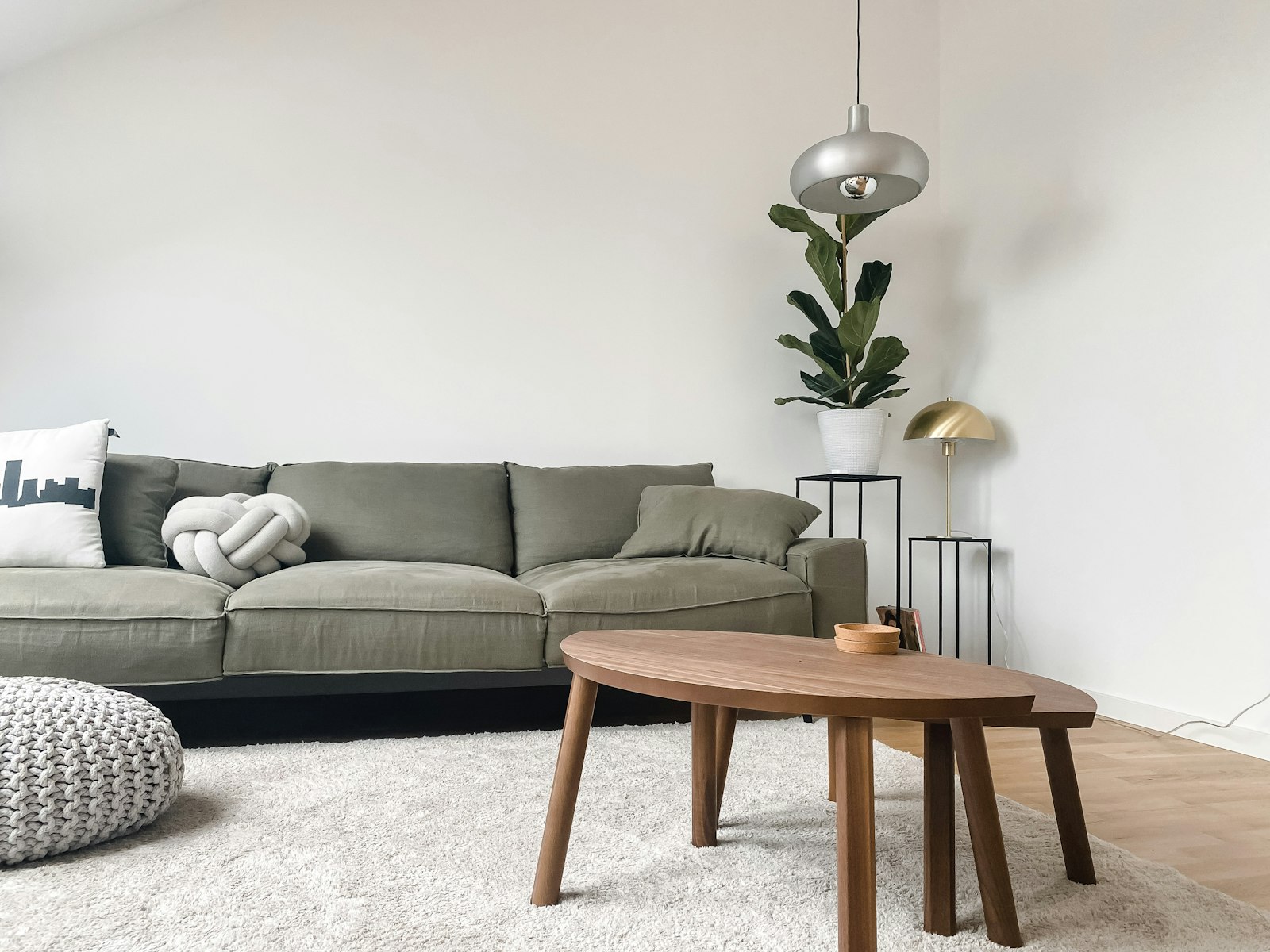
A neutral palette is the quiet backbone of so many beautiful homes. It feels timeless, calming, and endlessly adaptable, the kind of backdrop that lets your favorite pieces shine and never goes out of style. Yet neutrals are often misunderstood as boring or cold. The truth is that a well-built neutral scheme is rich, warm, and full of subtle depth. This guide will show you how to get it right.
Understand Undertones First
The secret to neutrals is undertone. Every white, beige, and grey leans slightly warm or cool, toward yellow and red, or toward blue and green. Mixing warm and cool neutrals carelessly is what makes a room feel off. Decide early whether you want a warm scheme, creams and taupes, or a cooler one, soft greys and stony whites, and let that guide every choice.
Build in Layers of Tone
A flat, single-beige room does look dull. The magic comes from layering several neutrals of varying depth, from the palest whisper of white to a deep greige or charcoal.
Follow a Light-to-Dark Range
Aim for a spread of values across the room: light walls, mid-tone upholstery, and a few darker anchors in wood or accessories. This gentle gradient gives the eye somewhere to travel and makes the space feel considered.
Let Texture Carry the Interest
When color steps back, texture must step forward. This is the golden rule of neutral decorating. A linen sofa, a chunky wool throw, a jute rug, smooth ceramics, and rough timber all read as visual richness even in a single color family. Without texture, neutrals fall flat; with it, they feel luxurious.
Add Warmth With Natural Materials
Wood, rattan, stone, leather, and woven fibers bring an organic warmth that keeps neutral rooms from feeling sterile. These materials introduce their own gentle colors and tactile depth, grounding the palette in nature.
Use Black as a Grounding Accent
A few touches of black or deep charcoal, a lamp base, a picture frame, slim hardware, give a neutral room definition and stop it from feeling washed out. These small dark anchors sharpen the whole scheme and make the lighter tones look crisp.
Introduce Quiet Contrast and Greenery
A single living plant adds the one note of true color a neutral room needs, fresh and alive. Beyond that, let contrast come from light and shadow and the interplay of materials rather than bold hues.
Conclusion
A neutral palette is anything but plain when it is layered with care. Mind your undertones, build a range of tones, and lean on texture and natural materials to bring it to life. The reward is a home that feels serene, sophisticated, and easy to live with for years. When you are ready to find the textured, tonal pieces that make neutrals sing, explore our curated collection at Little-Chapter.com.