

Moody Bedroom Mistakes That Make Dark Interiors Feel Depressing Rather Than Atmospheric
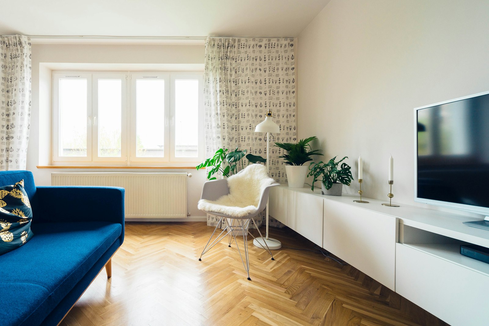
The moody bedroom at its best is one of the most genuinely beautiful room types available — enveloping, atmospheric, intimate, and deeply conducive to the rest and recovery that the bedroom exists to provide. At its worst, it is oppressive, visually heavy, and sleep-undermining in the way that poor color choices in any room undermine the room's function and the wellbeing of its occupants. The mistakes that produce the second outcome rather than the first are identifiable and avoidable, and understanding them is the prerequisite for committing to the dark bedroom with confidence rather than discovering the mistakes only after the paint is applied and the room is less habitable than it was before.
The first moody bedroom mistake is choosing a dark color without adequate tonal complexity: a color that is simply dark rather than a color that is dark and interesting. The dark colors that succeed in the moody bedroom are those with depth and complexity in their undertones — the deep navy with just enough green to shift toward blue-grey in different lights, the charcoal with enough warm brown to prevent it from reading as cold and institutional, the forest green with a dusty quality that prevents it from reading as a primary color despite its depth. The dark color that is simply neutral — a pure mid-grey, a flat dark brown, a primary dark blue — tends to read as functional or institutional rather than atmospheric, because it lacks the tonal variation that changes with the light and keeps the eye engaged.
Mistake: Insufficient Warm Artificial Lighting
The lighting mistake in the dark bedroom is the use of cool or neutral artificial light that, combined with dark wall colors, produces the dingy quality that distinguishes a dark room that has gone wrong from a dark room that has succeeded. Dark colors absorb light rather than reflecting it, which means that the quality of the light remaining in the room after absorption is more significant in a dark room than in a light one: cool light in a dark room has nowhere to go and nothing to warm it up, producing a flat, dull quality that is more oppressive than atmospheric. Warm light (2700K) in the same dark room is absorbed and reflected back at its warmest register, producing the golden, glowing quality of candlelight that is the emotional essence of the successful moody bedroom.
The quantity of warm light in the dark bedroom also requires attention: the light that is adequate for a light-colored room may be insufficient in a dark room where the walls absorb a significant proportion of the light rather than reflecting it. The dark bedroom typically needs more lamp positions than a pale-colored room of the same dimensions, and the lamps chosen should be those with warm shades that add to the overall warmth of the light rather than reducing it. The combination of two or three warm-toned lamps at varied positions in the room, supplemented by candles and perhaps a warm-toned ceiling fixture on a dimmer, provides the quality and quantity of warm light that makes the dark bedroom atmospheric rather than depressing.
Mistake: Wrong Textile Choices
The textile mistake in the dark bedroom is the continued use of pale or white bedding and curtains that creates a strong contrast with the dark walls — a contrast that prevents the enveloping quality of the dark bedroom from developing and makes the room feel like two rooms (dark walls, light bed) rather than one composed space. The moody bedroom that succeeds uses textiles in the same color family as the walls, layered in tonal depth rather than in exact match: the deep ink linen duvet cover that is darker than the charcoal wall, combined with pillowcases in a dusty slate that is lighter, combined with a throw in warm navy that introduces both warmth and depth. This tonal layering within the dark palette produces the richness and the cohesion that the contrast between dark walls and white bedding cannot achieve.
The curtain choice in the dark bedroom is particularly significant because curtains cover a large area and have more visual weight than most other textile elements: pale or white curtains in a dark bedroom create the most jarring of all the contrast mistakes, because they occupy the largest surface area. Curtains in deep, rich fabrics — velvet in a related dark tone, or linen in a color drawn from the wall's family — complete the enveloping composition of the moody bedroom in a way that pale curtains cannot. The investment in the correct curtain fabric is the most visually impactful single textile decision in the dark bedroom. Explore our curated collection at Little-Chapter.com for deep-toned linen bedding, velvet curtains, warm-toned lamps with amber shades, and bedroom accessories that make the moody bedroom atmospheric rather than oppressive.