

How to Master Neutral color palette guide
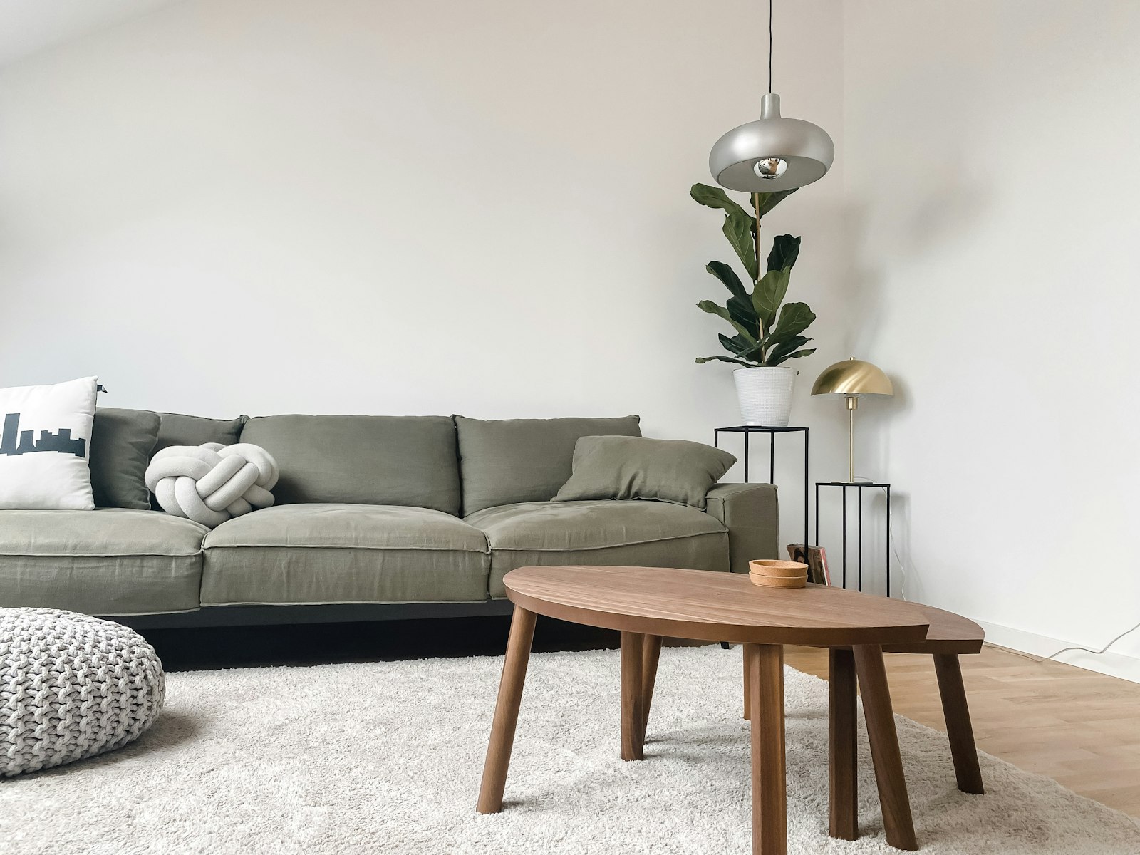
A neutral palette is the most requested and the most misunderstood look in decorating. People imagine it is the easy, safe option, then end up with a room that feels flat, beige, and a little lifeless. The truth is that neutrals are subtle and demanding; getting them right takes a designer's eye. Master the nuances and you will create a space that feels serene, layered, and quietly luxurious. Here is how the professionals do it.
The Mistake: Ignoring Undertones
The single biggest reason neutral schemes go wrong is undertone. Every white, beige, and grey leans warm or cool, and mixing them carelessly makes a room feel muddy and off in a way most people cannot quite name. The expert habit is to test every neutral against the others in the actual light of your room, and to commit to a warm or a cool direction before buying a thing.
Once you choose your temperature, sticking to it across paint, upholstery, and accessories is what gives a neutral room its effortless harmony.
Master the Range of Tones
A single flat beige is dull; a thoughtful spread of neutrals is sophisticated. Build a deliberate gradient from your palest white through mid-tone greiges to a deep anchor.
Use the Whole Scale
Aim for light walls, mid-toned furniture, and a few darker accents in wood, metal, or textiles. This range gives the eye somewhere to travel and stops the room from reading as a single washed-out note.
Let Texture Do the Heavy Lifting
This is the golden rule of advanced neutral decorating: when color steps back, texture must step forward. Linen, boucle, chunky wool, jute, smooth ceramic, and rough timber all read as richness even within one color family. The most beautiful neutral rooms are essentially a study in contrasting textures.
Ground With Natural Materials
Wood, rattan, stone, and leather bring an organic warmth that keeps a neutral room from feeling sterile. These materials carry their own gentle, earthy tones and tactile depth, anchoring the scheme in nature and adding the soul that pure paint colors cannot.
Add Definition With Dark Accents
A neutral room needs punctuation. A few touches of black or deep charcoal, a slim lamp, a picture frame, hardware, give the scheme crispness and stop it from drifting into blandness. These small dark anchors make the lighter tones look intentional and fresh rather than faded.
Find Contrast in Light and Green
With color minimized, let light and shadow create drama, and add one note of life with a living plant. The play of daylight across textured neutrals, plus a touch of green, is often all the contrast a refined neutral room needs.
Conclusion
Mastering a neutral palette means respecting undertones, building a full range of tones, leaning on texture, grounding with natural materials, adding dark accents, and letting light and greenery provide contrast. Do this and your neutral home will feel anything but plain. When you are ready to find the tonal, textured pieces that make neutrals sing, explore our curated collection at Little-Chapter.com.