

Color Mistakes That Are Quietly Undermining Your Home's Atmosphere
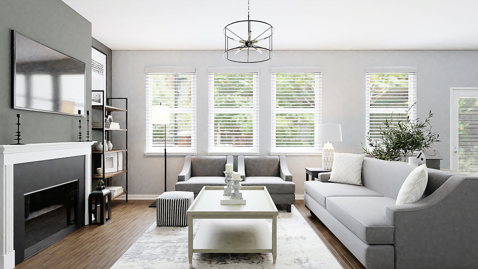
The color mistakes that undermine domestic atmospheres are often invisible to the people who live with them — not because they are subtle but because they have been present for long enough that the household has adapted to them rather than questioning them. The room that always feels slightly wrong, slightly cold, slightly disjointed, or slightly unsatisfying despite furniture and decoration that should work is often suffering from a color error whose identification and correction would transform the experience of the space for a fraction of the cost of new furniture or a full redecoration. The color mistakes identified in this guide are the ones most consistently responsible for rooms that underperform their potential.
The first and most widespread color mistake is choosing paint colors in isolation from the fixed elements of the room: the floor (especially if it is a strong color such as dark hardwood, terracotta tile, or grey stone), the ceiling (if it is not painted white), and the fixed-upholstery furniture that will not be replaced. Paint color selected against a small chip held up to the wall, without systematic evaluation of how it will interact with the floor and furniture colors that dominate the room's fixed palette, produces the frequency of paint regret that is among the most common home decoration complaints. The correction is always to sample at scale on the actual wall before committing, and to evaluate the sample against all the fixed elements of the room simultaneously.
Mistake: No Palette, No Principle
The color mistake that produces the most persistently unsatisfying domestic environments is the absence of any unifying color principle across the home — the home where each room has been decorated in a different color family that bears no relationship to the colors in adjacent rooms, producing a sequence of spaces that feel disconnected and individually appropriate but collectively chaotic. The home whose rooms share a palette — not necessarily matching colors but colors from the same family, with the same temperature, and at the same level of saturation — feels designed even if individual rooms are simply furnished; the home whose rooms are colored without reference to each other feels accidental regardless of how much thought went into each room individually.
The practical correction for an existing home without a color principle is to identify the existing color that appears most in the home — the floor color, the sofa color, the most-used curtain color — and to use that as the anchor for a palette that informs future paint and accessory decisions throughout the home. This anchor-based approach does not require painting every room the same color (which would be monotonous) but uses the anchor as a reference against which each new color decision is evaluated for compatibility: does this new color work with the anchor? Does it share its temperature, its level of saturation, its relationship to the natural materials present? If yes, it belongs in the palette; if no, it should be reconsidered.
Mistake: Forgetting Artificial Light Conditions
The lighting-condition color mistake is responsible for a specific category of color regret: the paint color that looked perfect in the showroom's daylight, or beautiful on the north-facing wall of one room, but fails to satisfy under the warm artificial light of evening in a south-facing bedroom. Different light conditions change colors in predictable ways: warm artificial light shifts warm colors toward richness and cool colors toward flatness or muddiness; north-facing daylight reveals the true undertone of a paint color without the warming influence of direct sun; south-facing light in afternoon hours can make moderate colors look much more saturated than intended. The correction is to assess paint samples under all the light conditions that the room will experience, not only under the best-case daylight conditions.
The most reliable way to evaluate a paint color under artificial light conditions is to hold the paint chip or sample board near the light source that will dominate the room at the time of day it is most occupied — the bedside lamp for the bedroom, the overhead pendant for the dining room — and to assess whether the color under that light is as satisfying as it was under showroom conditions. Colors that pass both the daylight and the artificial light assessments are the most reliable choices for rooms used under both conditions. Explore our curated collection at Little-Chapter.com for cushions, throws, rugs, and accessories in carefully selected color palettes that work beautifully under both natural and artificial light and help anchor a color principle throughout your home.